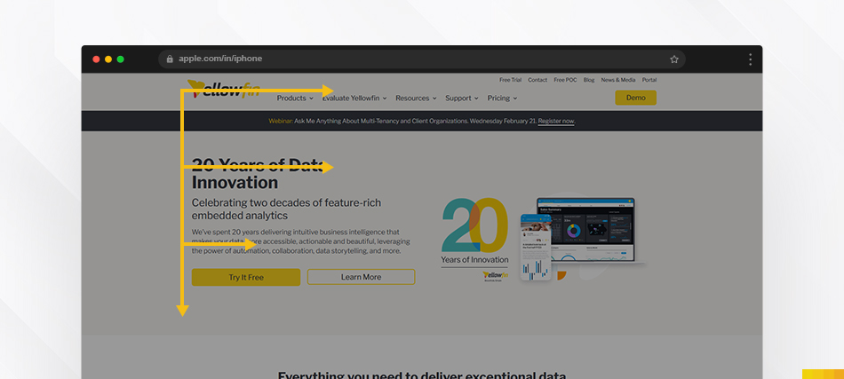
The organization of elements to guide the viewer’s attention is called hierarchy. It helps users understand what’s most important and what order to follow. Like headings in an article, it creates a visual roadmap.

Construct your visual hierarchy based on the innate movement patterns of the human eye to optimize for increased. Use F or Z patterns to make your design visually appealing. Let’s explore both the F-pattern and Z-pattern hierarchy rules:
This pattern is characterized by a top-down and left-to-right movement, forming an “F” shape. Users typically start by scanning across the top of the page, then move down a bit and scan horizontally again. Finally, they scan the left side of the page vertically.

- Headline Importance: Place crucial information, such as headlines and key messages, along the top horizontal line of the “F” to capture attention quickly.
- Left-Aligned Content: Important details and key content should be left-aligned to align with the vertical movement of the F-pattern.
- Visual Elements on the Left: Incorporate compelling visuals, graphics, or calls-to-action on the left side to attract attention during the initial scan.
In the Z-pattern, users start by scanning across the top of the page (forming the first diagonal of the Z), then move down the page diagonally (forming the second diagonal of the Z), and finally, scan horizontally again at the bottom of the page (completing the Z).

- Top-Left Focal Point: Place the most crucial information, such as headlines or primary visuals, in the top-left corner to align with the starting point of the Z-pattern.
- Diagonal Flow: Guide users through a diagonal flow of content, emphasizing key features and information along the two diagonal lines.
- Call-to-Action at the End: Position important calls-to-action or conversion elements at the bottom right of the page to coincide with the endpoint of the Z-patter
- Content-Type: Consider the nature of your content. F-patterns are often suitable for content-heavy pages, while Z-patterns work well for pages emphasizing visuals and calls to action.
- User Goals: Understand the primary goals of your users. If they are looking for specific information, the F-pattern may be more effective. If you want to guide them toward a conversion, the Z-pattern could be a better fit.
By strategically applying either the F-pattern or Z-pattern hierarchy rule based on your content and user goals, you can optimize your webpage layout for better user engagement and increased conversions.


