The Banana Rule in UI/UX design leverages the natural user hand movement, resembling a banana’s curve. It optimizes interactions by placing vital elements where users naturally reach. This principle enhances user satisfaction, streamlines design processes, and empowers users to shape the final product.
Success in UI/UX Design is like handing someone a banana and having them instinctively know how to peel it; it’s all about creating designs that people effortlessly understand and navigate.
In the realm of UX/UI design, the “banana rule “is a simple yet powerful principle that can help ensure that a website or application is easy to understand and use.
There are numerous principles and guidelines to follow that help designers create intuitive, visually appealing, and user-friendly interfaces. One such principle that has gained recognition and importance is the Banana Rule.
In this blog, we will dive deep into what the Banana Rule is, and why it matters in UX/UI design, along with live examples to illustrate its application.
The Banana Rule is a metaphorical concept in UX/UI design that emphasizes the natural hand movement of users when interacting with digital interfaces. It suggests that the path a user’s cursor or finger takes when navigating a screen should resemble the shape of a banana.
This concept aims to optimize user interactions by placing important elements and actions within the user’s natural reach zone.
Before we delve deep into this, let’s understand the banana shape and how it is used in the user experience interfaces.
When users interact with a screen, whether it’s on a desktop computer, tablet, or smartphone, their primary movements generally follow a gentle curve. This curve mimics the shape of a banana, starting from the upper-left corner, curving down and to the right, and then returning up to the upper-right corner.

The Benefits of the Banana Rule in UX/UI Design:
- Enhanced User Satisfaction: The iterative approach of the Banana Rule ensures that the final product aligns with users’ needs, leading to higher satisfaction levels.
- Efficient Design Process: By involving users early, designers can identify and address potential issues before they become major roadblocks.
- Empowered User Base: Users feel valued and empowered when their feedback shapes the final design, fostering a sense of ownership and loyalty.
Similar to the banana that ripens, the design process also evolves through three stages: Green, Yellow, and Brown. Each stage represents a crucial phase in the iterative design journey.
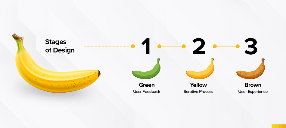
- The Green Stage – Early Release: In this stage, designers introduce an initial version of their product to users. While this version may lack the final polish, it serves as the foundation for gathering invaluable feedback. By engaging users right from the start, designers gain profound insights into their preferences and pain points.
- The Yellow Stage – Iterative Improvement: As the design journey progresses, armed with the insights of user feedback, designers embark on a journey of continuous refinement. This stage involves making gradual yet significant enhancements to the interface, interactions, and overall user experience.
- The Brown Stage – Maturity Achieved: In this culminating stage, the design has matured through multiple rounds of iteration and feedback cycles. At this juncture, the product emerges as a polished, refined for delivering a happy user experience.The result is a design that adapts according to the precise and custom requirements of its users.
Since we have understood what is banana rule is about and the different stages of it. Now, let’s explore how the Banana Rule can be applied in real-world UX/UI design scenarios.
One of the most common applications of the Banana Rule is seen in navigation menus. Placing the main navigation menu at the top of a webpage or app aligns with the natural user movement.

Consider the example of Amazon’s website. The search bar and primary navigation menu are located at the top, within easy reach of the user’s cursor or thumb. This intuitive placement ensures that users can access crucial functions without strain.
Call-to-action (CTA) buttons are essential elements in UX/UI design. Whether it’s a “Buy Now” button on an e-commerce site or a “Sign Up” button on a registration page, CTAs should be strategically positioned along the path.

For instance, the online courses app places its “Start Learning and Design Thinking” CTA button conveniently at the bottom of each listing, making it easily accessible to users as they browse.
The arrangement of content should also align with the design. For instance, in a blog post or article, the most important content should be at the top-left, capturing the user’s attention immediately.
As the user scrolls down, related content and supplementary information can be presented, following the natural flow of their reading or browsing behaviour.

On news websites like The New York Times, the most important news articles are often positioned at the top-left of the homepage. As users scroll down, they encounter related stories, following the natural flow of their reading.
In the realm of mobile app design, given the limited screen of real space, designers must make every pixel count. Placing essential functions, such as the menu icon or a swipe-able image gallery, within easy reach of the user’s thumb ensures a seamless and enjoyable experience.
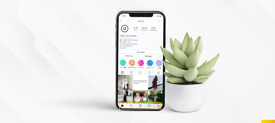
In the Instagram app, essential functions such as creating a new post or accessing the user profile are located at the bottom of the screen, within easy reach of the user’s thumb. This design enhances the overall user experience.
In E-commerce platforms placing the product image, title, and price at the top-left of the card allows users to quickly assess the item. Additional details, such as product descriptions and customer reviews, can follow below, following the natural reading pattern.

Etsy’s product listings typically feature the product image, title, and price at the top-left of the card. This allows users to quickly assess the item, while additional details like product descriptions and customer reviews are placed below.
Forms are a common element in web and app design, and they play a crucial role in user interactions. When designing forms, especially for tasks like registration or checkout, the Banana Rule can streamline the process.
Place input fields, labels, and validation messages in a way that follows the banana-shaped path, ensuring that users can easily fill out the form without unnecessary scrolling or navigation.
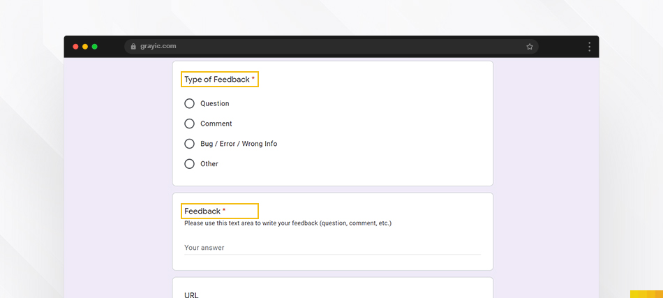
Google Forms follows the Banana Rule by placing input fields and labels in a logical order that aligns with the user’s natural reading and input flow.
User journeys within an application or website should also align with the flow of their purpose while they can navigate starting from one step to the next step after completing the first one.

User journeys within an application or website should also align with the flow of their purpose while they can navigate starting from one step to the next step after completing the first one.
In mobile gaming, controls and buttons are essential for user engagement which ensures that key controls like movement, actions, or inventory management are within easy reach of the player’s hands. This enhances gameplay and reduces frustration.
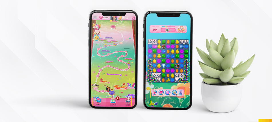
In mobile games like “Candy Crush,” the game controls and key actions are strategically placed at the bottom of the screen.
In dashboard design, where users often need to access various pieces of information at a glance, the Banana Rule can be instrumental.
Placing the most critical data widgets or summary information at the top-left corner of the dashboard ensures that users immediately see what’s most important
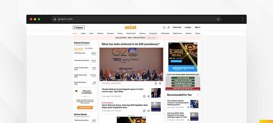
For example, in a financial app like Mint, the main financial summary with income and expenses is typically placed at the top-left, providing users with a quick overview of their financial status.
As we’ve seen through various examples, from navigation menus to mobile app interfaces, applying the Banana Rule can lead to more intuitive and user-friendly designs. So, the next time you embark on a UX/UI design project, remember the banana-shaped path and let it guide you towards a more successful and user-centric design. Happy designing!