February 06, 2024 24 min read
February 06, 2024 24 min read
February 06, 2024 24 min read
How much percentage of users return to a website and why do they return?
You are right, 87.5% of people return to your website for a personalized experience.
According to “Forbes Advisor, India” roughly 252,000 new websites are created every day, breaking down the figure by the number created 10,500 websites per hour and 175 per minute.
That’s a huge number. In those vast seas, what makes your website or brand stand out? It’s your design and user experience. As our virtual interactions continue to evolve along with artificial intelligence rapidly evolving, the demand for captivating aesthetics and intuitive interfaces has reached an all-time high.
When you bridge the gap between design and user experience, you will get more eyeballs and click baits. If you want to influence action through your design from your audience, you must be able to grab attention and understand the audience which will drive action

Before digging into the concepts of design, let us take a look at the history of design and how it is evolved in all these years.
Design was not born instantly it all began in the prehistoric era, when the seeds of communication were sown. It started with cave paintings that aesthetically conveyed hunting strategies and social narratives. Fast forward to ancient civilizations, and we see design flourish through intricate scripts, inspiring architecture, and carefully crafted tools. While beauty played a role, these creations were fundamentally driven by function.
The Middle Ages saw a shift towards religious iconography, with stained glass windows, illuminated manuscripts, and grand cathedrals captivating the faithful. The design served a clear purpose: to educate and inspire.
Then came the Renaissance, a period of intellectual and artistic explosion. Design blossomed alongside art and science, with advancements in printing, perspective, and anatomy influencing everything from book layouts to building plans.

The 20th century saw design truly come into its way, focusing on user-centered design to the rise of advertising and branding. And now, in the 21st century, the digital revolution has redefined design once again. UX/UI design has become the new frontier, where every pixel, button, and interaction is meticulously crafted to make technology intuitive and delightful. From sleek smartphone interfaces to user-friendly websites, design is all about bridging the gap between humans and machines.
But throughout this fascinating journey, one thing remains constant: the underlying purpose of design. It’s not just about making things look pretty; it’s about making them work for the people who use them. It’s about simplifying, guiding, informing, and ultimately, enriching our lives.
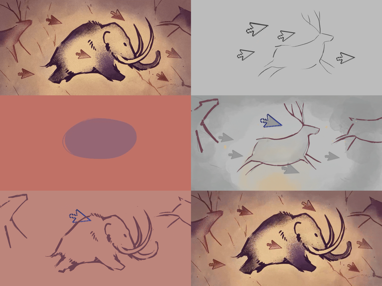
Source: Medium
Fun Fact: Archeologists assumed that ancient cave paintings might have included motion design.
Now, let us understand the power of visual communication, how to understand your audience, and craft beautiful and user-friendly experiences. We will start from the basics of the design and delve deep into concepts.
Graphic and UX/UI design are distinct yet interconnected disciplines crucial for creating compelling visual experiences. Each has its core principles, but their collaboration is essential for crafting aesthetically pleasing and functional designs that resonate with users.
Let us define each and understand their principles.
Graphic design is the art of visual communication, where designers use various elements such as color, typography, and imagery to convey a message or evoke a specific emotion. Graphic design core principles include.
A good design uses space wisely, making sure elements have room to breathe, and there’s a balanced harmony between them. Space is like the canvas where your design comes to life. It’s not just about what’s there; it’s also about what isn’t.
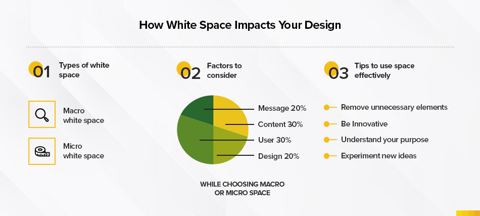
Imagine your design as a set of scales. Balance ensures that no one part feels too heavy or light. It’s about distributing elements evenly so that the overall design feels stable and pleasing to the eye.
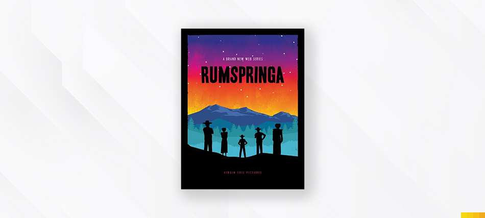
All the elements in this design are very well balanced and aligned to make it look perfect.
Using the Rule of thirds, divide your design into three columns and three rows. Placing important text or focal points along the grid lines or intersections in your design layout can enhance the visual appearance

Elements balanced in a landscape photo
The organization of elements to guide the viewer’s attention is called hierarchy. It helps users understand what’s most important and what order to follow. Like headings in an article, it creates a visual roadmap.
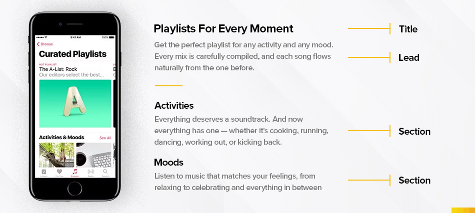
Visual hierarchy grabs attention with vital elements
Construct your visual hierarchy based on the innate movement patterns of the human eye to optimize for increased. Use F or Z patterns to make your design visually appealing. Let’s explore both the F-pattern and Z-pattern hierarchy rules:
This pattern is characterized by a top-down and left-to-right movement, forming an “F” shape. Users typically start by scanning across the top of the page, then move down a bit and scan horizontally again. Finally, they scan the left side of the page vertically.
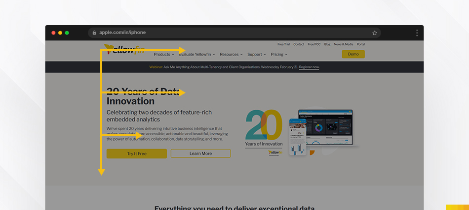
Showing the F-Pattern
In the Z-pattern, users start by scanning across the top of the page (forming the first diagonal of the Z), then move down the page diagonally (forming the second diagonal of the Z), and finally, scan horizontally again at the bottom of the page (completing the Z).

Showing the Z-Pattern
By strategically applying either the F-pattern or Z-pattern hierarchy rule based on your content and user goals, you can optimize your webpage layout for better user engagement and increased conversions.
Lines and shapes are foundational elements in a design, playing a pivotal role in conveying messages, guiding attention, and evoking emotions. Their importance extends across various design disciplines, influencing visual communication.
Shapes are arranged in the middle to grab attention, Check out: Works
They explain the importance of direction and flow, structure and organization, emotional impact, visual hierarchy, balance, harmony, recognition, and memory. In essence, they serve as the building blocks of design, influencing composition, visual impact, and communication. The deliberate use of these elements allows designers to craft meaningful and aesthetically pleasing visuals that effectively convey messages and engage audiences.
They explain the importance of direction and flow, structure and organization, emotional impact, visual According to research conducted by Color Communications Inc., individuals take approximately 90 seconds to shape their perception of a brand. Within this brief timeframe, decisions ranging from 62% to 90% are significantly swayed by color alone.

The right color palette is crucial for good design
Color is like the mood-setter of your design. Different colors evoke different emotions. Psychology plays a role in shaping your design which effectively communicates your brand message Understanding color theory helps you create a visual atmosphere that resonates with your audience.
Fact: Colors have vibes. Warm colors (red, orange) feel energetic, while cool colors (blue, green) feel calm.
Typography deals with fonts and how text is arranged. It’s not just about what the words say but also how they look.

The right font choice can convey a mood or establish a brand identity. Beyond mere legibility, typography plays a crucial part in evoking emotions and guiding the viewer’s experience.

Display of various fonts
Monotype study shows typography choice can boost positive consumer response by up to 13%
Texture adds a tactile dimension to your design. Even on a screen, it can make things look tangible or evoke a specific feeling. It’s the difference between a sleek, modern look and a warm, inviting one.
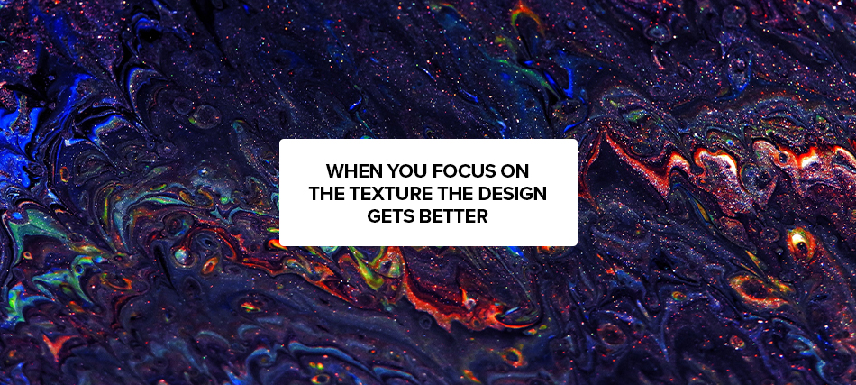
When discussing the overall vibe of a design, texture typically pertains to the interaction between various elements. Introducing inventive techniques to incorporate texture in graphic design can enhance fascination and dimensionality. Common strategies for generating texture encompass the utilization of patterns, embossing, and introducing noise or grain to images.
In graphic design, to have a recognizable identity you must have a strategy to have a visual appeal for your product or service. This can be achieved only with consistent brand image, color psychology, and typography.
Since we have learned the principles of graphic design. Let us do the worksheet what are the principles required for branding
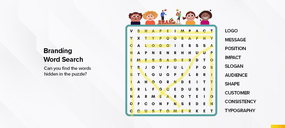
Now that we have understood the graphic design principles. let us understand what UX/UI design and its principles and how they are interconnected.
Have you ever felt amazing when you opened an app, started exploring it, and ended up buying products? The reason behind it? It is due to USER EXPERIENCE(UX) that drives the users all the time through a neat USER INTERFACE(UI).
Fact: According to Forrester’s research, Trillion dollar UX problem Every $1 invested in UX can potentially yield a return of $100, resulting in a staggering 9,900% ROI.
User experience (UX) design is a critical aspect of creating user-friendly and intuitive digital products and services. It involves the process of enhancing user satisfaction and usability by improving accessibility, efficiency, and overall pleasure during interaction with a product. In recent years, the field of UX design has been greatly influenced by advancements in technology, particularly the rise of generative AI.
“Focus on the user and all else will follow.” – Rule #1, Google’s “Ten Things” Philosophy
A well-designed user interface (UI) ensures that users can easily navigate through an application or website, find what they need, and complete tasks efficiently.
- Enhance brand perception,
- Build customer loyalty
- Drive user engagement.
It enables businesses to differentiate themselves from their competitors and stand out in the market.
Feeling overwhelmed? Processing all the information in one go. Worry not, let’s make it more simple and easy to understand.
“Design-driven businesses have outperformed the S&P by a whopping 228% over the past 10 years. The bottom line is good design = good business.” – Joanna Ngai, UX designer, Microsoft
To create impactful UI/UX designs, it is crucial to adhere to its principles. Let us look at these principles which serve as guidelines that help designers create intuitive and user-friendly interfaces.
1. Consistency: Consistency in design elements and interactions across your application or website builds trust and familiarity with users. Use consistent colors, typography, and layout to create a cohesive and unified experience.

Spotify maintains a consistent visual identity across different platforms, using the same green color, bold typography, and simple layout for their playlists, artists, and search functions.
2. Simplicity: Avoid clutter and unnecessary elements that can confuse users. A clean and minimalist design allows users to focus on the essential tasks and content.
Google Search ranks higher in its user experience for its minimalist search bar and uncluttered layout allowing users to focus on their search query without distractions.

3. Functionality: Functionality in UI/UX is like the hidden wizard behind a smooth online experience. It ensures buttons and menus not only look good but work smoothly.
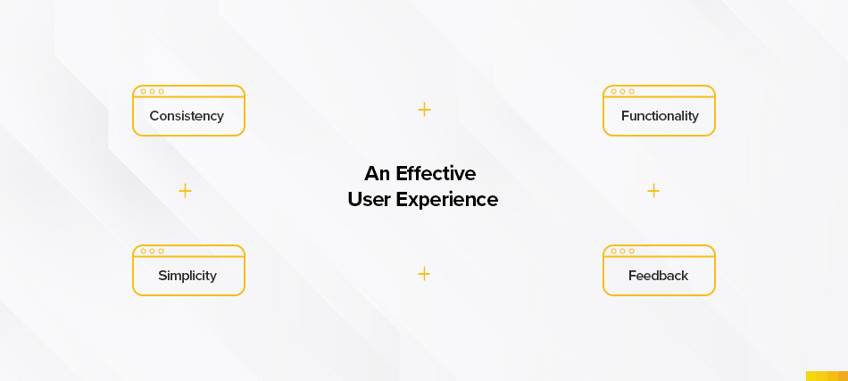
4. User Feedback: Provide timely and informative feedback to users when they interact with your design. This helps users understand their actions and progress, ensuring a smooth and seamless experience.
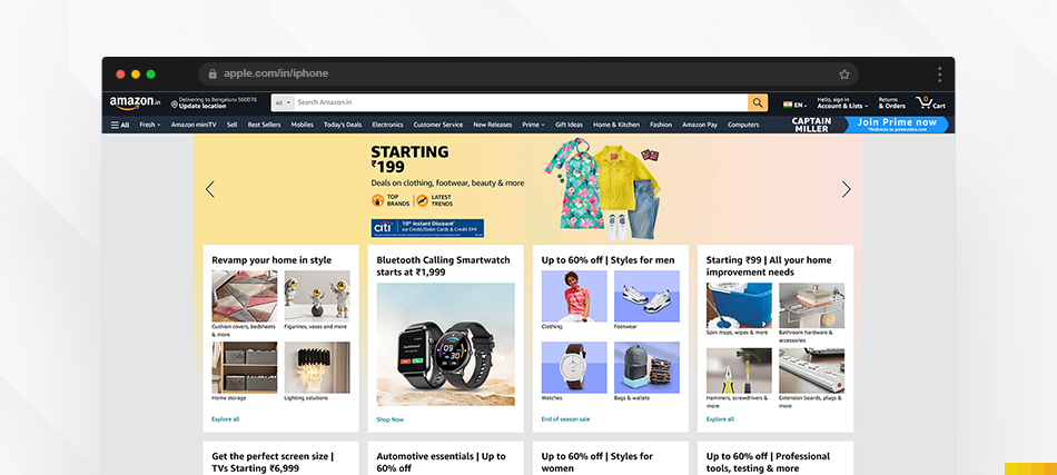
Amazon offers real-time order tracking updates and confirmation emails with progress and delivery information.
Come, let us dive deeper into the key principles of UI/UX design to help you understand how to create designs that leave a lasting impact on users.
User-Centered Design (UCD) is the secret recipe for creating top-notch products. By focusing on users, it ensures solutions meet their needs, making them happy and loyal. The magic lies in researching user needs, creating personas, and constantly testing. This not only boosts user satisfaction but also increases conversion rates, bringing in more revenue.
Lindsay Derby, Senior Product Designer at HubSpot, explains it best. “User-centered design is an iterative design approach that is fundamentally driven by making decisions based on the user needs”
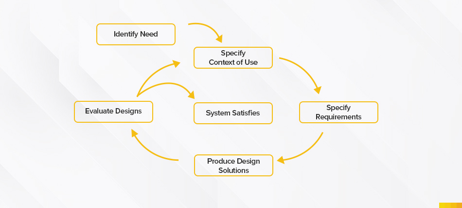
According to Forrester Research, Websites with good user experience have a 200% higher conversion rate.
Big players like Spotify, Nike, and Apple swear by UCD, making products that people love.
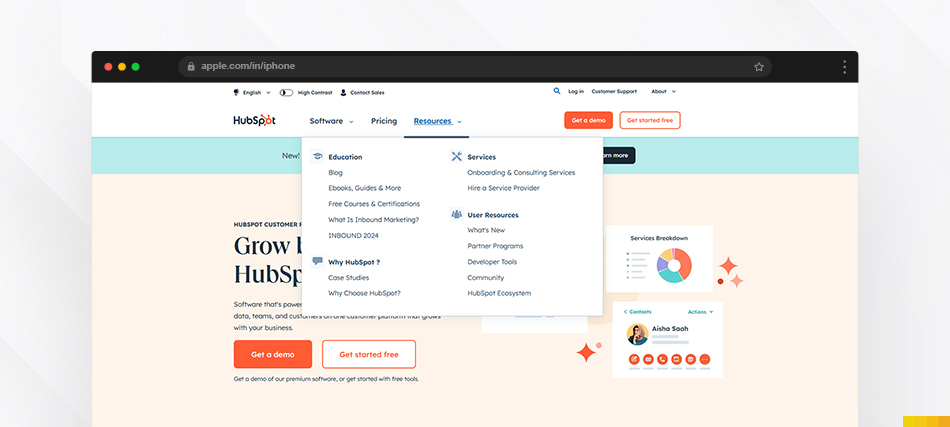
Information Architecture (IA) is like the blueprint for making websites easy to use. It’s about organizing and labeling information so users can quickly find what they’re looking for. Think of it as a map that guides users through a site. Good IA improves navigation, making it easy for users to find what they need, and boosting engagement.
How to make Information organized?
- Conducting a content inventory
- Understanding user needs
- Creating clear labels
Fact: Websites with good IA see a 35% reduction in bounce rates, and users who find information quickly are twice as likely to return.
Have you ever bought clothes without trying them on? Probably not.
Similarly, prototyping and wireframing serve as a trial run for design ideas, ensuring a user-friendly outcome by identifying and addressing issues before the final product is launched.
How much development time can be cut if we test prototyping?
Using low or high-fidelity tools, designers focus on essential user flows and get feedback through testing. This helps make the final product more user-friendly. Usability testing prototypes can catch 85% of issues early.
Taking a consultative approach to improving the experience, determining calls to action, implementing responsive web design, and considering Fitt’s Law can improve user experience.
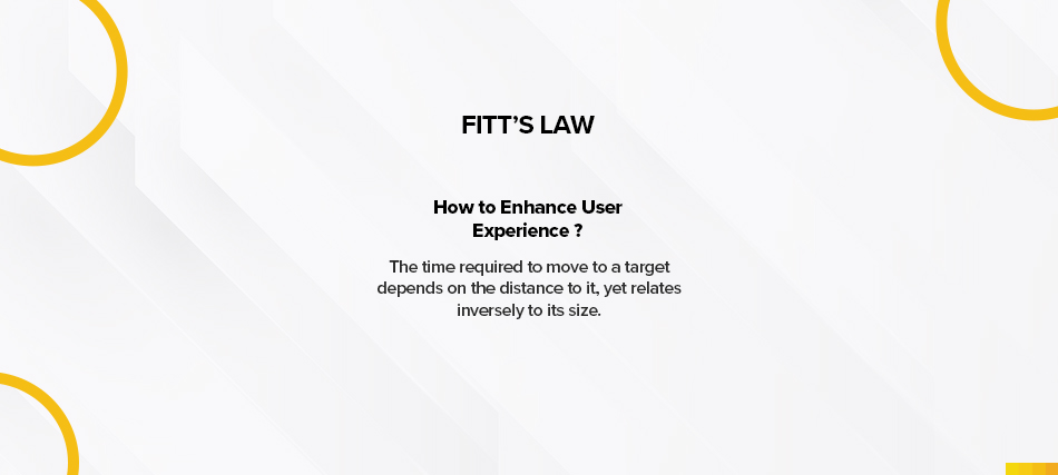
Ever noticed Apple’s MacBook Pro Touch Bar? It’s a handy touchscreen above the keyboard, streamlining tasks like Google searches and adjusting settings.

Keeping commonly used options close, follows Fitt’s Law, making user interactions smoother.
Whether you’re researching, prototyping, or creating graphics, there are tons of free and premium tools available in the market. Here are some of my best findings for easy use/
- Adobe Fireworks: Great for creating web graphics without coding.
- Adobe XD: Design websites, apps, and prototypes, perfect for team collaboration.
- Axure: Free tool for wireframing, prototyping, and creating user flows.
- Inkscape: An affordable alternative to Adobe Illustrator for vector graphics.
- Sketch: End-to-end software with features like non-destructive editing and code export.
- Storyboard Software: Tools like Storyboarder and Toon Boom for visualizing user experiences.
These tools can make your design easier and more accessible.
As we enter 2024, the digital landscape is seen as a battlefield for attention, and the weapons of choice are pixels, lines, and user experience. In this situation, two powerful forces clash and collaborate: graphic design and UX/UI design. While often perceived as separate disciplines, their true potential lies in the harmonious fusion at the intersection.

For too long, graphic design and UX/UI design have existed in separate spheres. It’s time to dismantle these myths and uncover their combined power. Imagine graphic designers not only crafting visual magic but also understanding user needs through research and testing. Conversely, picture UX/UI designers embrace the storytelling and visual composition expertise of their graphic counterparts. This cross-pollination will lead to:
- A Shared Language: Let’s break down the technical jargon of both and establish a vocabulary that unites both disciplines. How do colors, typography, and imagery translate to usability, accessibility, and experience?
The magic lies in the overlap, where aesthetics and usability tango. A thoughtfully designed interface utilizes graphic design principles like hierarchy, color theory, and whitespace to guide users seamlessly through their goals. Conversely, UX/UI research informs graphic design decisions, ensuring visuals not only look good but also resonate with the target audience and support the overall user flow. - An Iterative Process: Design is an ever-evolving process. Graphic elements shouldn’t be static creations, but integrated into prototypes and tested alongside user flows. This iterative dance allows both graphic and UX/UI designers to refine their solutions together and ensure a seamless user journey.
Despite the undeniable benefits, bridging the gap isn’t without its challenges. Communication breakdowns, differing workflows, and a lack of mutual understanding can create friction. To overcome these hurdles, fostering collaboration from the get-go is crucial.
- Joint workshops and brainstorming sessions can break down myths and encourage cross-pollination of ideas.
- Shared design libraries and style guides ensure consistency and prevent visual dissonance.
- Prototyping and user testing create a common ground for evaluation and iteration, allowing both disciplines to refine their contributions based on real user feedback.
Fact: Research by Adobe, says that 80% of creative professionals believe AI will enhance, not replace, their work
In 2023, we have seen the rise of generative AI, as we evolve its impact will increase more. Many companies started to implement automated tools and generative AI in their day-to-day work which is easier, more accessible, and saves time.
According to the Capgemini Research Institute, “Almost 60% of organizations are implementing or exploring generative AI”
The present scenario is, can algorithms like ChatGPT, Midjourney, and magic design in Canva compose user experience, write content, and design visuals truly replace human creators?
A study by the McKinsey Global Institute estimated that up to 800 million jobs could be lost to automation by 2030, representing about 20% of the global workforce.
“Artificial intelligence will leave about 90 percent of people without jobs in the next 10 years”- said Kunal Shah, Founder and CEO of fintech unicorn CRED.
90% is threatening you, isn’t it? Worry not, this new technology isn’t here to steal the designer’s job; but to be a co-pilot, boosting creative potential and efficiency. While the potential for disruption is undeniable, the focus should shift towards understanding how generative AI can amplify and collaborate with human creativity, not surpass it.
For example, considering IKEA’s demand sensing technology which is an AI-generated innovative furniture concept, the final designs selected for production were judiciously chosen to reflect IKEA’s signature style and brand identity. The human element, with its understanding of user needs and brand DNA, remained the crucial decision-maker
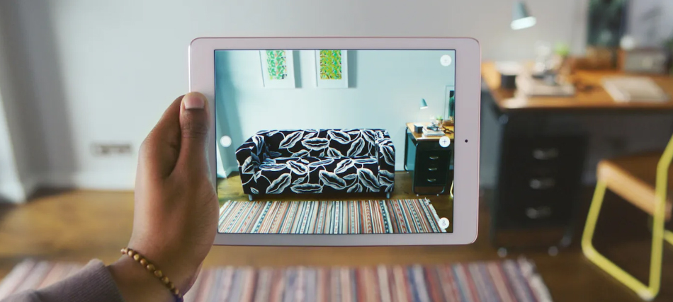
Image source: IKEA
IKEA uses AR technology, to check how the furniture looks in our house.
IKEA Retail (Ingka Group) Global chief digital officer Parag Parekh said: “AI has been a game-changer for us, making our routine tasks easier with the use of smart models. However, the tool is only as good as the data it provides. But the real heroes are our co-workers who bring valuable insights and ensure the quality of data”
The effectiveness of AI lies in its output and how we can utilize it effectively. Here are the ways it can help us

- Automated Design Elements: AI can generate countless variations of logos, color palettes, or even entire wireframes based on user preferences and design principles. This frees up designers to focus on the strategic aspects of design, tackling complex problems and exploring high-level creative avenues.
One example of automated elements is Canva, I have been using it to create visuals for this blog. If I can do it, without knowing anything about design, you can do it too. Try it here
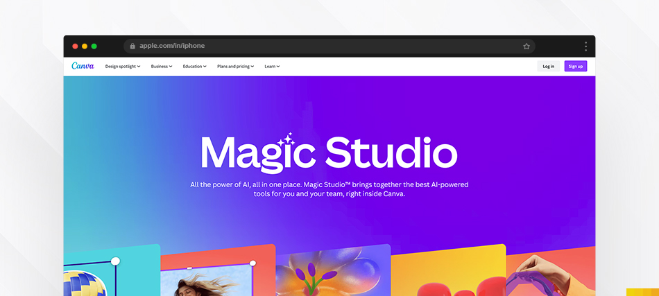
Source: Canva
- Personalized Experiences: Forget one-size-fits-all design. AI can dynamically tailor design elements to individual users, creating interfaces and visuals that resonate on a deeper level. Personalized color palettes, custom-curated imagery, even AI-generated fonts – the possibilities are endless.
Example: Consider Spotify’s “Discover Weekly” playlist. Powered by AI algorithms, it analyzes your listening habits and recommends personalized music you might enjoy.
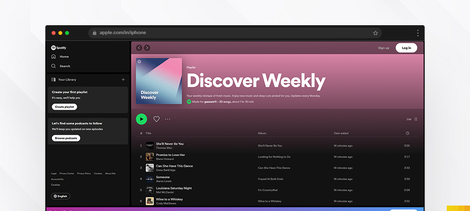
Source: Spotify
- Data-Driven Design: Design decisions informed by data? AI can analyze user behavior and preferences, providing invaluable insights to guide design choices. Imagine heatmaps highlighting areas for improvement or A/B testing powered by AI, allowing for ultra-fast optimization.
Example: LinkedIn’s AI analyzes user browsing behavior on the platform, informing recommendations and job postings for a more personalized experience.
Now, in 2024 we stand on the verge of a design revolution, where human ingenuity and AI-powered intelligence have to merge, to create experiences that are both beautiful and profoundly meaningful. Picture this:
- A graphic designer sketches an initial concept, feeding it into an AI tool that generates dozens of variations based on real user data and proven design principles.
- The UX/UI designer seamlessly integrates these variations into a prototype, conducting user testing with the help of AI-powered heatmaps and feedback analysis.
- The final design emerges a collaborative masterpiece where human intuition and AI-powered data work in perfect harmony to create a user-centric experience that speaks to both hearts and minds.
Generative AI is the new hot topic of town, but this exciting future poses crucial questions:
With time and effort, we can figure out things and understand the viability of the design. The journey of design has always been about pushing boundaries and embracing new possibilities. By understanding the interplay between graphic design, UX/UI design, and generative AI, we can prepare ourselves to paint masterpieces on the canvas of the future. The gap is not a divide, but a bridge waiting to be crossed.
Let’s step onto it together, hand-in-hand with technology, and co-create a world of design that is both exceptional and deeply human.
DROP US A LINE AND LET US KNOW WHAT’S ON YOUR MIND
DROP US A LINE AND LET US KNOW WHAT’S ON YOUR MIND


